D O O D L E
Logo

Branding

Dr Tyre

Rebranded: Stronger, Smarter, Sleeker

Dr. Tyre approached us with the goal of revitalizing their brand to better reflect their expertise and position in the market. The objective was to develop a cohesive brand identity that resonates with their target audience and stands out in a competitive industry.

To strengthen brand presence and consistency, the new identity was extended across all customer touchpoints. We designed striking vehicle graphics for maximum visibility on the road, created branded merchandise such as caps and mugs to enhance recognition, and developed professional staff uniforms that reflect the updated visual identity—contributing to a strong and unified brand experience.

Dr Tyre – A Bold New Identity

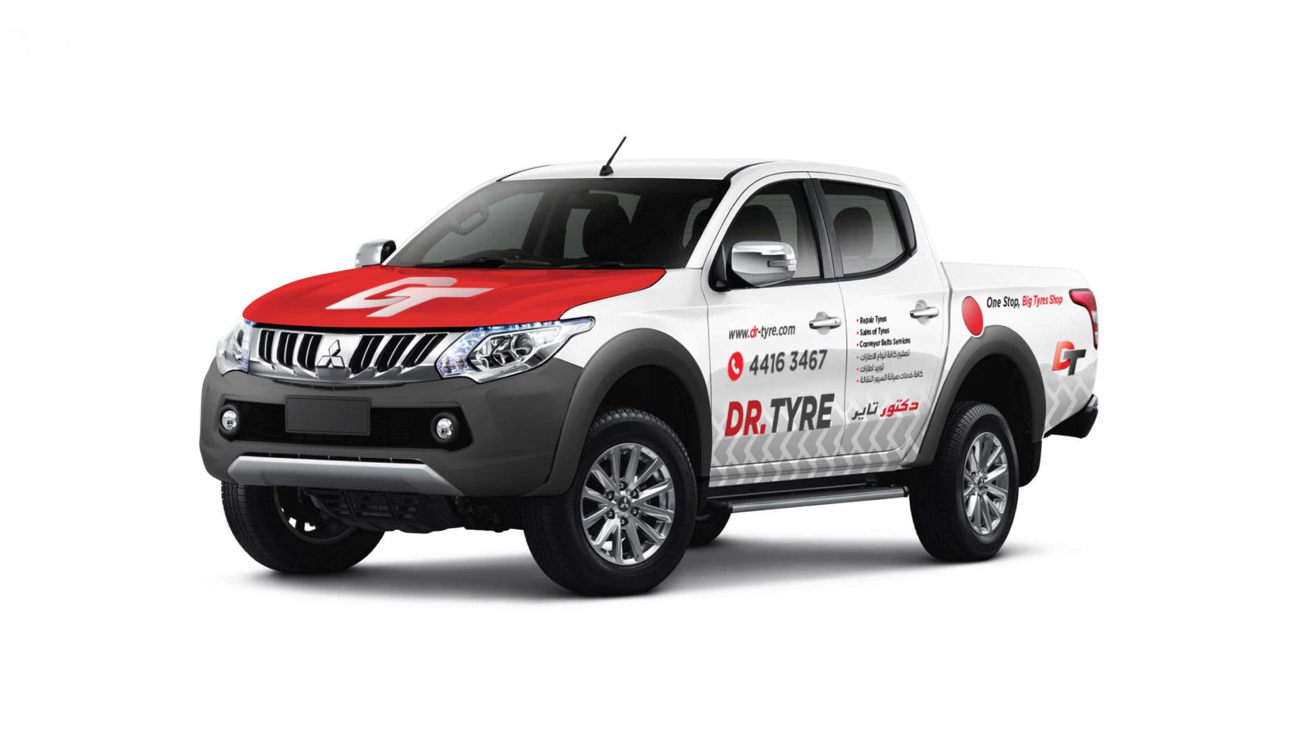
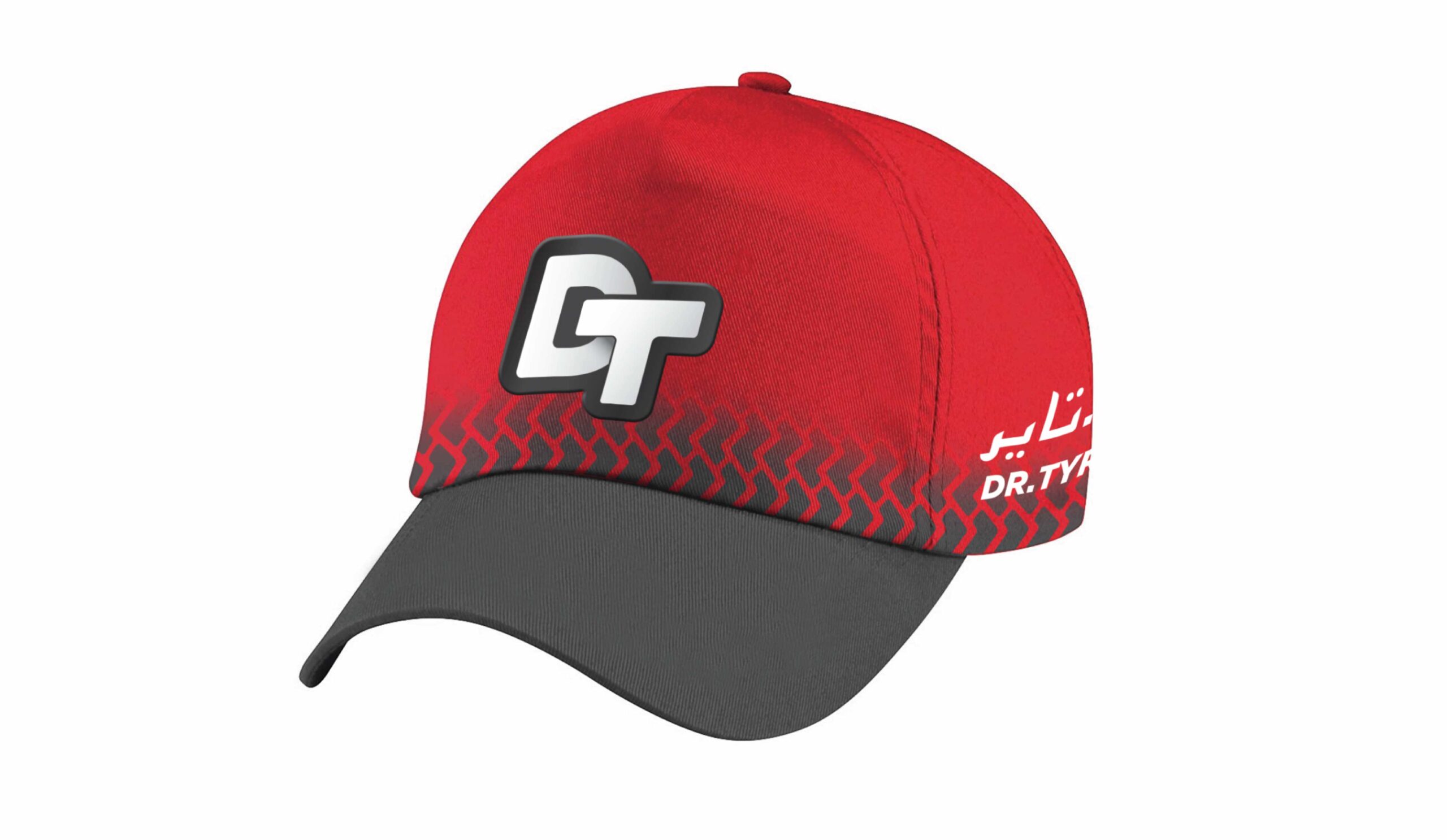
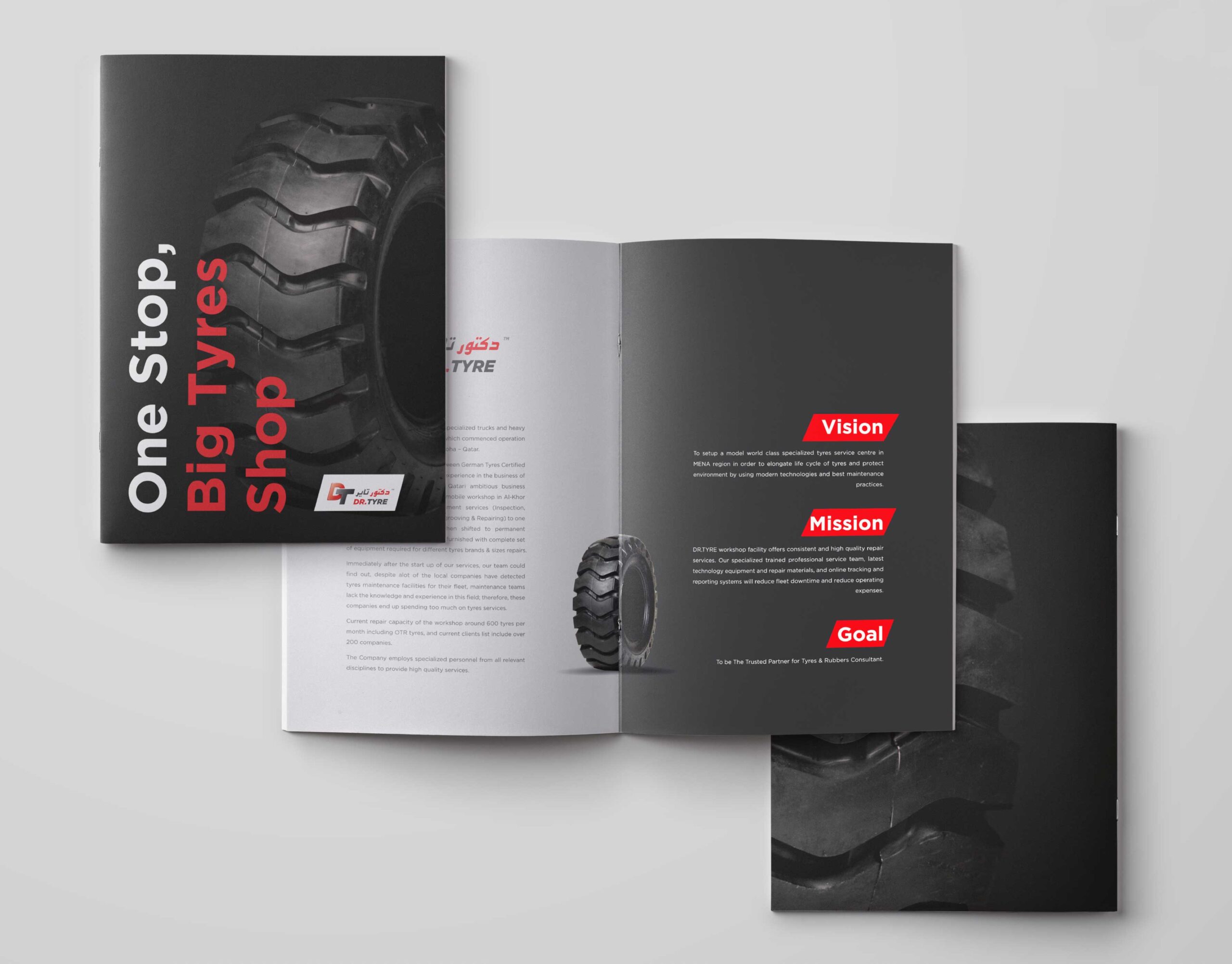
The rebranding initiative for Dr. Tyre aimed to create a modern, professional logo that reflects the company’s strength and reliability, while developing a cohesive visual identity system adaptable across various platforms and mediums. This included vehicle branding, merchandise, and staff uniforms. Our design approach focused on delivering a bold and contemporary look. We crafted a distinctive “DT” monogram using the Plafond font, symbolizing motion and durability core attributes of Dr. Tyre’s services. The chosen color palette of red and black reinforces energy, professionalism, and impact. To ensure regional relevance, the branding was developed in both English and Arabic, enhancing accessibility and cultural alignment within the Qatari market.

Visual Identity

Brand Guidelines

Get started now

Big idea? Small question? Let’s talk — great things often start with a simple hello.

Doha-Qatar

43 Nuaija، 330 Rawdat Al Khail St

Contact

+974 5517 0288

[email protected]

© 2025 | Alright’s reserved by Doodle Brand