D O O D L E
Logo

Branding

Phorest

Brand Identity: Stronger, Smarter, Sleeker

The Phorest branding initiative was developed to create a modern, future-ready identity that positions the company as a pioneer in sustainable pharmaceutical manufacturing. Headquartered in Switzerland, Phorest leads the industry by integrating bio-renewable resources, improving process efficiency, and reducing waste and pollution, while strengthening supply chain resilience.

Brand Identity

Phorest – A New Commitment

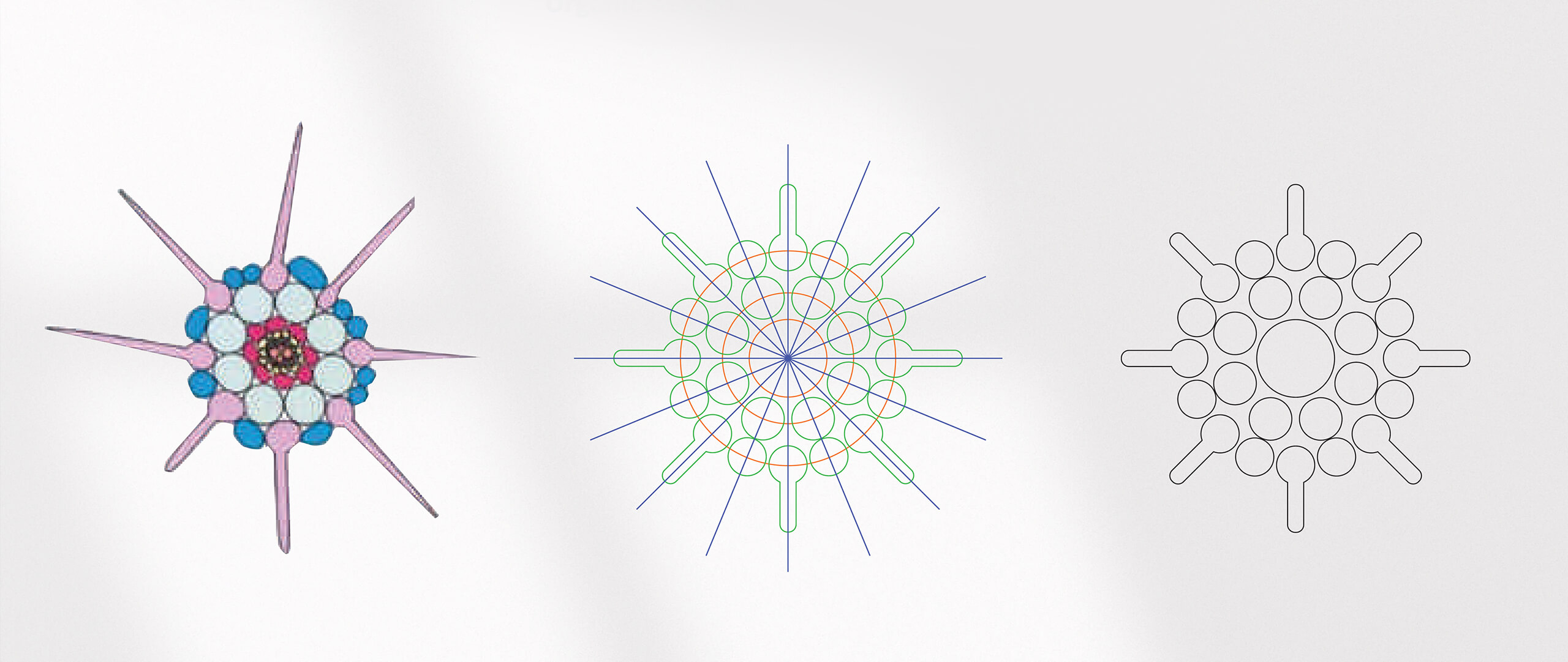
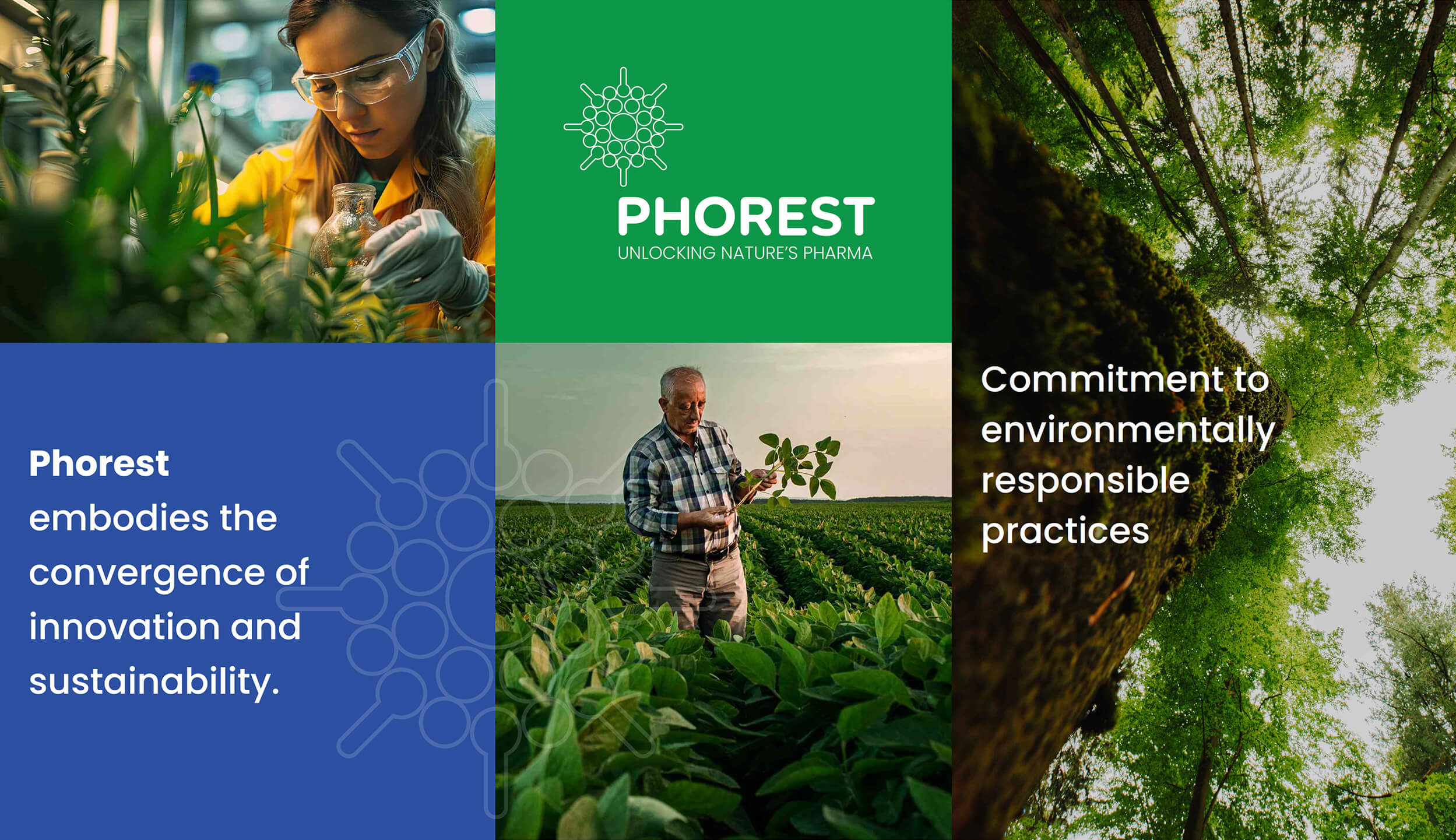
Our goal was to design a brand identity system that communicates Phorest’s commitment to innovation, sustainability, and technological agility. The visual identity combines a clean, contemporary design with elements inspired by renewable resources and environmental responsibility, reinforcing Phorest’s vision of a greener pharmaceutical future.

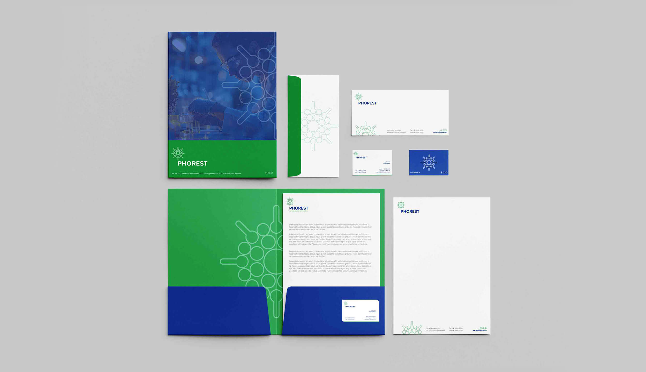
The complete identity system includes logo design, typography, and a versatile color palette, ensuring consistent application across digital platforms, corporate communications, and physical touchpoints. The visual strategy highlights trust, innovation, and sustainability, core values that strengthen Phorest’s positioning as a trusted partner driving the future of sustainable pharmaceuticals.

Visual Identity

Brand Guidelines

Get started now

Big idea? Small question? Let’s talk — great things often start with a simple hello.

Doha-Qatar

Nuaija, Rawdat Al Khail St

Contact

+974 5517 0288

[email protected]

© 2025 | Alright’s reserved by Doodle Brand